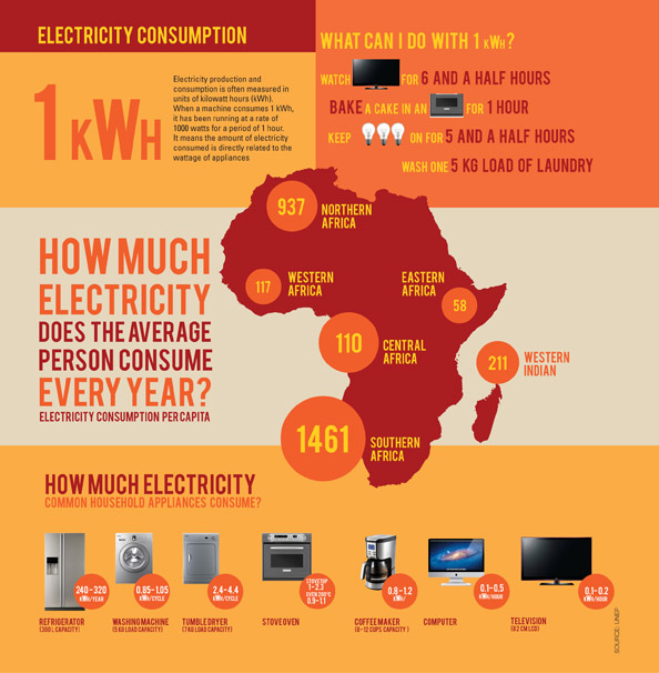
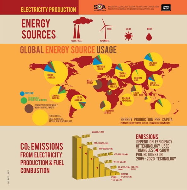
Understanding how electricity is produced and consumed is the first step in reducing your electricity usage. This post looks at an interesting way of comparatively understanding your electricity consumption.
Sustain Our Africa, a 110% Green flagship, produced a series of infographics for their Summit in October 2012. These infographics look at a range of issues affecting the Green Economy. Infographics have become a popular way of illustrating seemingly complex information in a fun and accessible way.
We particularly like this one as it shows you how much electricity each home appliance uses. If you are planning on starting to save electricity at home - check out this infographic to see where you can have the most impact.


